By Vincent Liu (Data Analyst, DATA Lab)
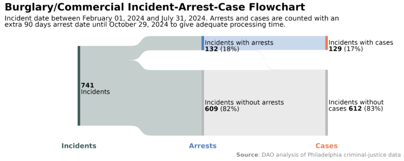
The District Attorney’s Transparency Analytics (DATA) Lab strives to iterate and improve our reporting on data about the criminal legal system in Philadelphia. For the past several years, we have published monthly Incident-Arrest-Charges (IAC) “Data Snapshots” that helped people see the relationship between incidents reported to police, arrests made by police, and cases charged by the Philadelphia District Attorney’s Office (DAO) (see, e.g., October 2024 snapshot). Beginning December 2024, we will be sharing a new graphic to replace the current Incident-Arrest-Charges chart, and including a new felony-level case outcomes flowchart that improves on work previously presented to City Council and in a past data story. We hope these new data visuals will allow readers to better conceptualize the flow of incidents and cases in the Philadelphia criminal-legal system and provide more data than previously possible.
Please let us know what you think. We are eager to hear what you think about these visuals and if they are helpful in understanding a complex system. Please submit feedback to [email protected], or let us know if you’d like to meet to discuss this or other work product.
Origins, Features, and Examples of Sankeys
- The Sankey diagram, originally developed in the late 19th century, focuses on showing how data flows across a series of time points or events.
- Each category along the bottom x-axis represents an event, and categories within each stage progression are represented by proportional line segments that further break out numbers from the previous stage.
- Sankeys have been used in criminal legal contexts, and elsewhere. For example: The United Kingdom Minister of Justice uses a Sankey to show how offenders with different criminal history categories received different case outcomes.
- The Urban Institute used Sankey to visualize where Philadelphia’s SEPTA spent their budget on, broken down by the source of budget and program type (see p. 60).
Introducing the “IAC Sankey” and the “Case Outcomes Sankey”
The new IAC Sankey and Case Outcome Sankey graphics bring the following benefits:
1. Sankeys are a more visual way to show the progress of incidents, arrests, and charges across the Philadelphia criminal-legal system.
The current Incident-Arrest-Charge (IAC) chart placed incidents, incidents with an arrest, and incidents with a case open side by side to foster better comparison. Whereas that version clearly shows the numerical differences for each stage, this new version emphasizes the flow through stages, while also retaining clear labeling, easy category comparisons, and strong readability.

Our current version of the Incident-Arrests-Charges graphic shows numbers and gives some notion of proportionality, but doesn’t highlight the interconnectedness of the information.

The new proposed Incident-Arrest-Charges Sankey shows the same numbers, but emphasizes proportionality and flow between stages.
2. The Sankey chart provides clearer information about case outcomes
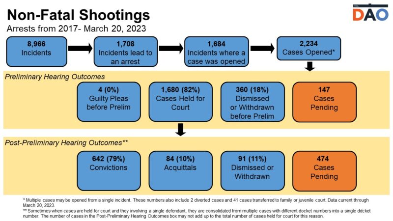
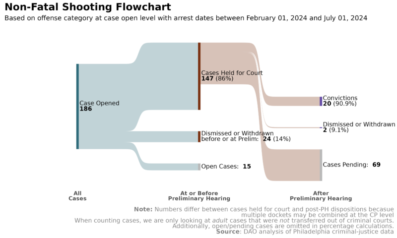
The IAC charts highlighted the difference between the number of reported incidents and the number of arrests, as well as the difference between the number of arrests and number of cases opened. Due to scale and other factors, it was difficult to also show case outcomes in the same format. Implementing Sankeys allows us to apply the same visualization format to the case resolution process, offering a clearer look into felony-level cases through the Preliminary Hearing and post-Preliminary Hearing stages. Because we took time to develop adaptable code for these Sankeys, we are now able to create them efficiently for a range of offense categories. The offense categories used in this data – Commercial Burglary for “IAC Sankey” and Non-Fatal Shootings for “Case Outcomes Sankey” – are just illustrative examples.

The old version of our Case Outcomes graphic includes lots of data, including I-A-C information along the top, but had to be manually-inputted into a PowerPoint slide. Here, the black arrows represent the flow across phases.

The new Case Outcomes Sankey can be automatically produced using code and is arguably a better visual representation of the underlying data and process. Separating the I-A-C information into its own graphic allows the viewer to focus on cases from open to resolution.
3. The Sankey charts provide more accurate numbers
We are continually updating our code to better reflect what is happening in the system. The code for our previous I-A-C charts has not been updated in several years. Instead of investing that time in the old version of these charts, we turned our attention to ensuring these new charts and calculations matched our present understanding of the data.
We welcome feedback, comments, and questions on this change and any other thoughts you may have: [email protected].